Farm Life Creamery

2025 Artisan Creamery Brand Refresh & Refine

Straight Outta South Dakota

The Brief

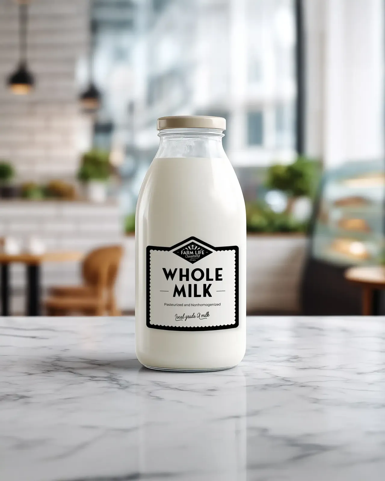
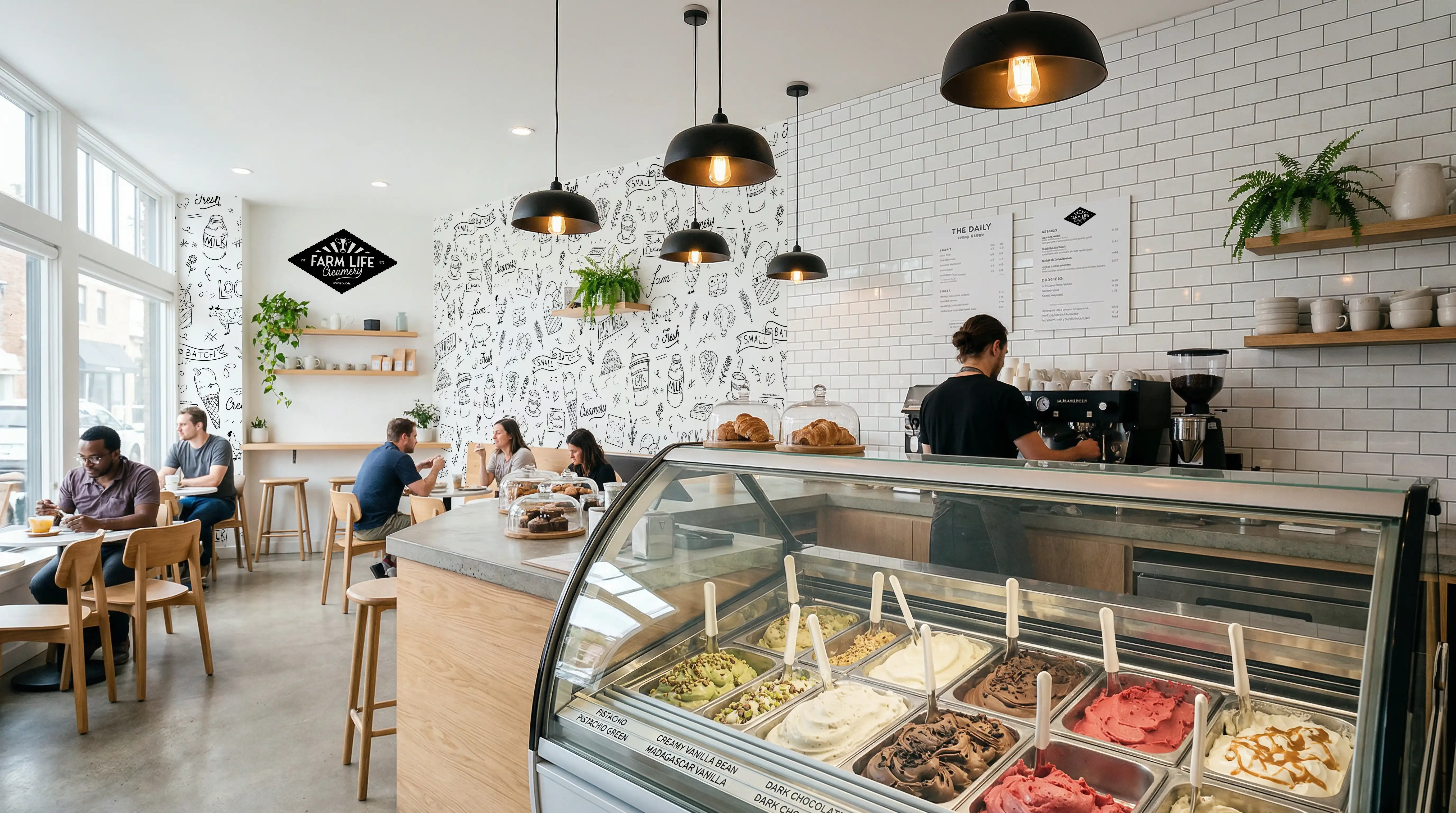
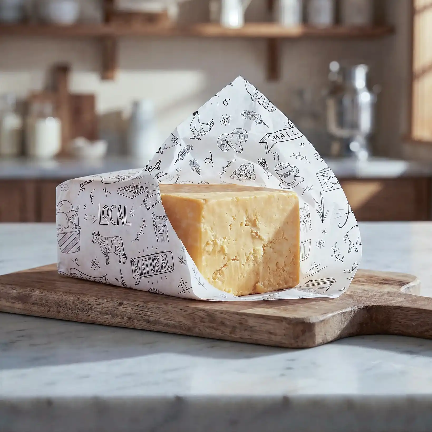
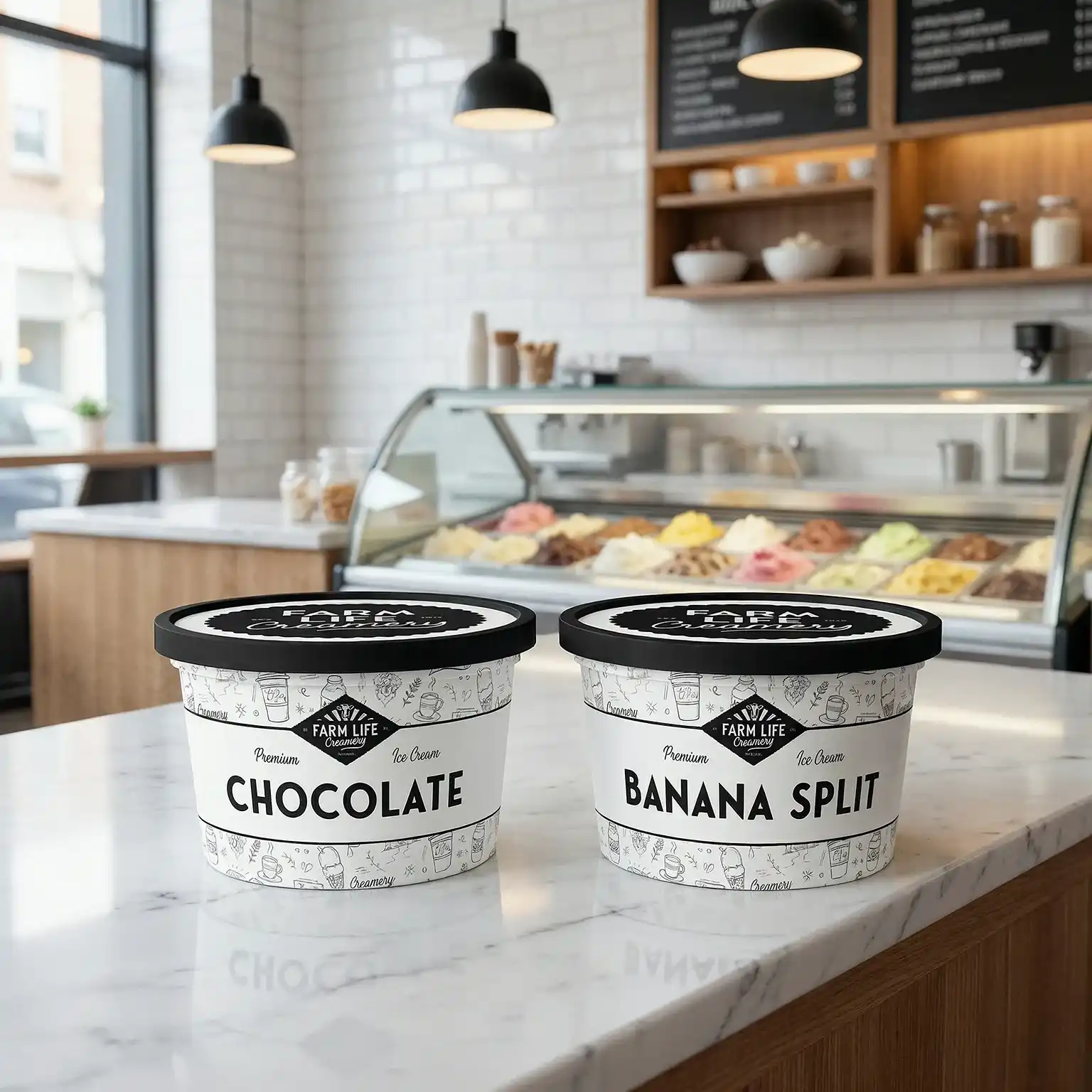
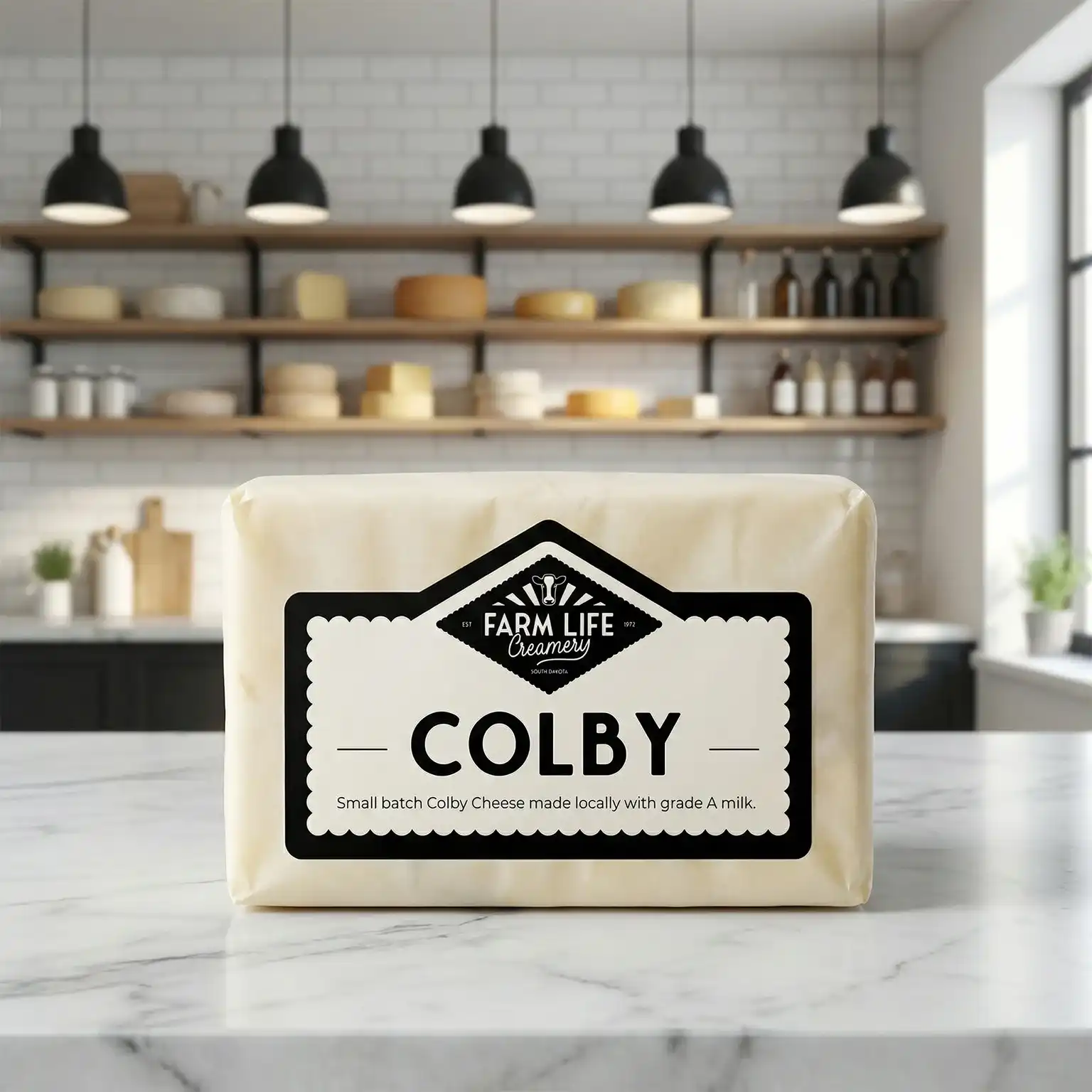
Farm Life Creamery is a small on-farm creamery in South Dakota producing cheese, bottled milk and small-batch ice cream. The owner came to me with an existing logo and identity she had built herself, which had served the creamery well but was showing its limits as the business grew.

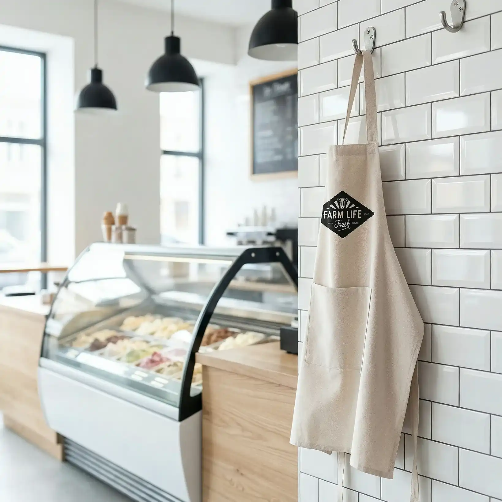
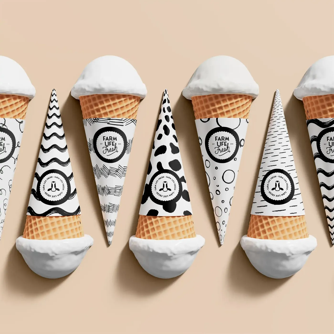
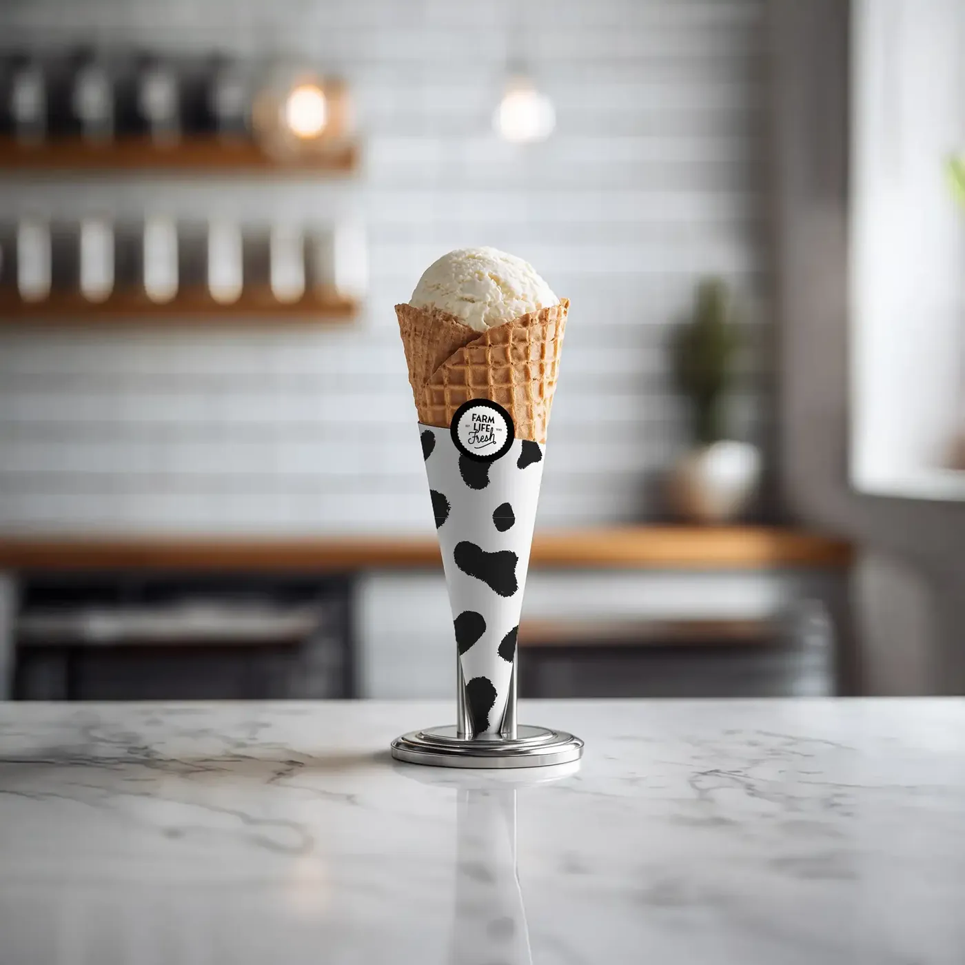
She was opening a branded storefront inside a local grocery store and needed the identity to stretch to cover a wider product range under a sub-brand called Farm Life Fresh. The existing logo had the foundations of the right idea but needed refining before it could work hard across packaging, signage, and retail shelving.

Farm Life Creamery brief image 1 Farm Life Creamery brief image 2 Farm Life Creamery brief image 3
Farm Life Creamery project showcase
What the studio did

The original logo had the right instincts: a diamond badge, rays, a cow, a sense of heritage. I kept the structure and refined everything inside it, replacing the clip art cow with a cleaner illustration and tightening the typography to feel more intentional and classic. The colour palette shifted to high-contrast black and white, which gave it the old ice cream parlour quality the client was after while making the packaging punch on shelf.

I developed a full responsive logo suite so the mark could scale properly across every application, then created a doodle illustration system that carries the playful, local feel across cone wraps, product tubs, tissue paper, bags and the shopfront wall.

Farm Life Creamery studio image 1 Farm Life Creamery studio image 2 Farm Life Creamery studio image 3

From the Founder

"I loved working with Emma! She was able to take the assets we already have and strengthened our brand by offering a background pattern, secondary logos — exactly what we needed!"

Laura Klock

Farm Life Creamery finale image 1 Farm Life Creamery finale image 2