Hearth and Hammer

2023 The Brief Association Competition Entry

Unlock the Healing Power of the Planet

The Brief

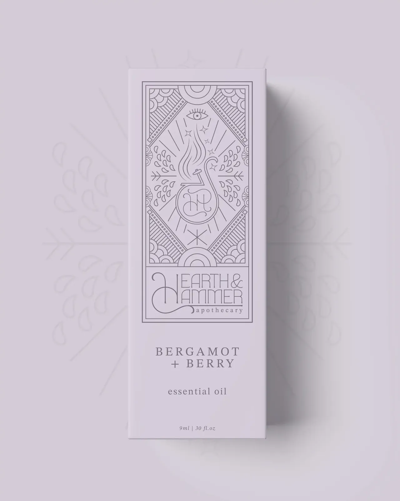
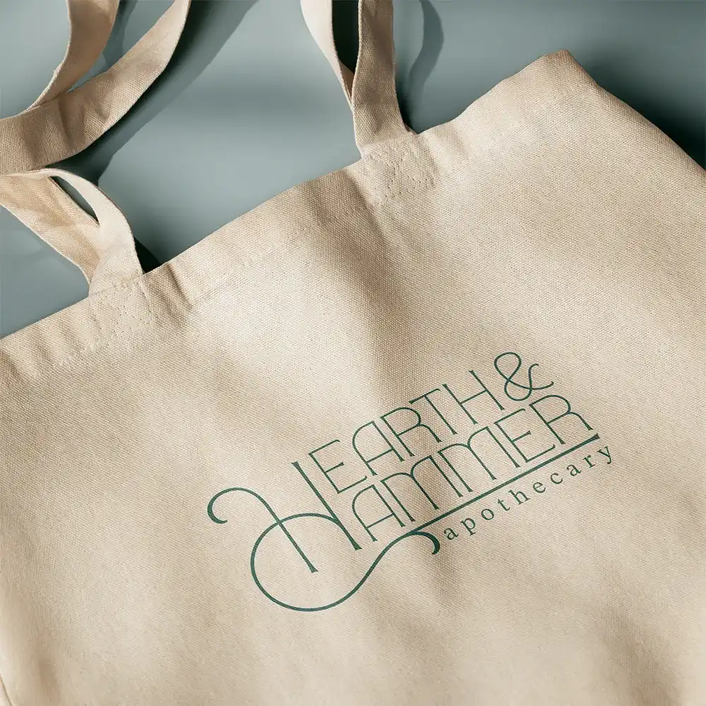
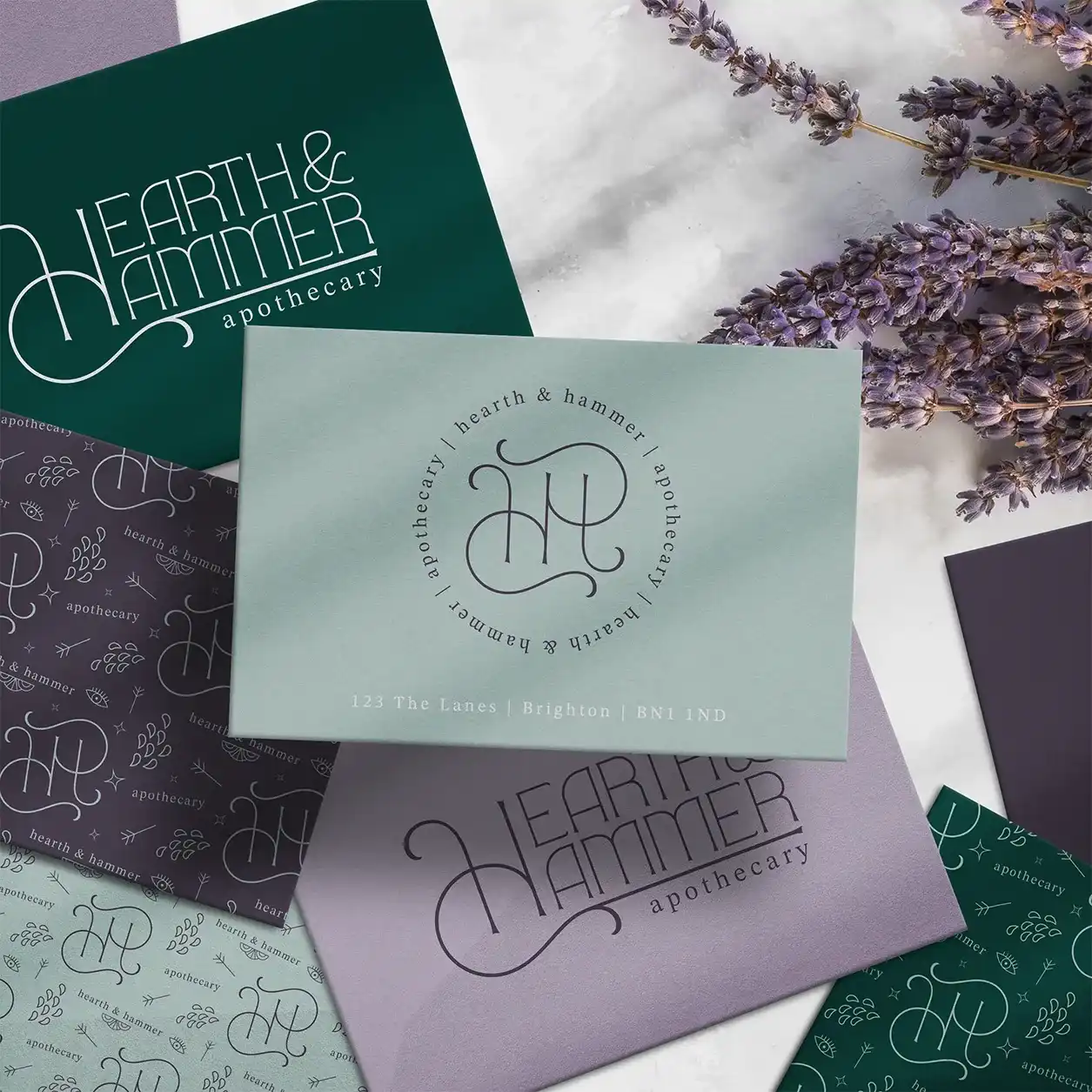
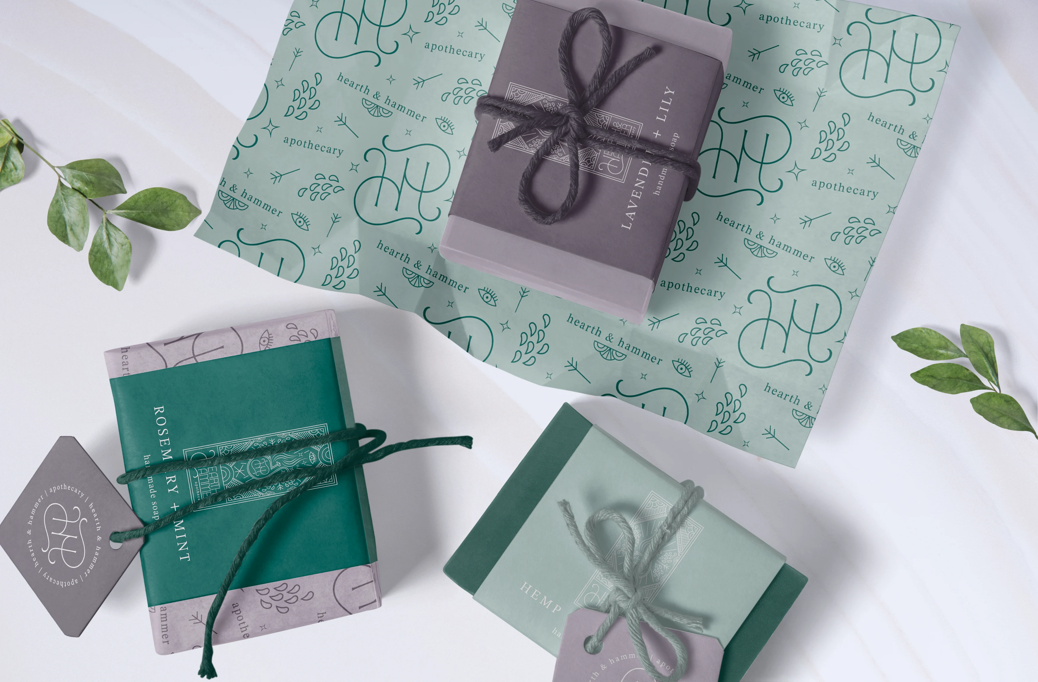
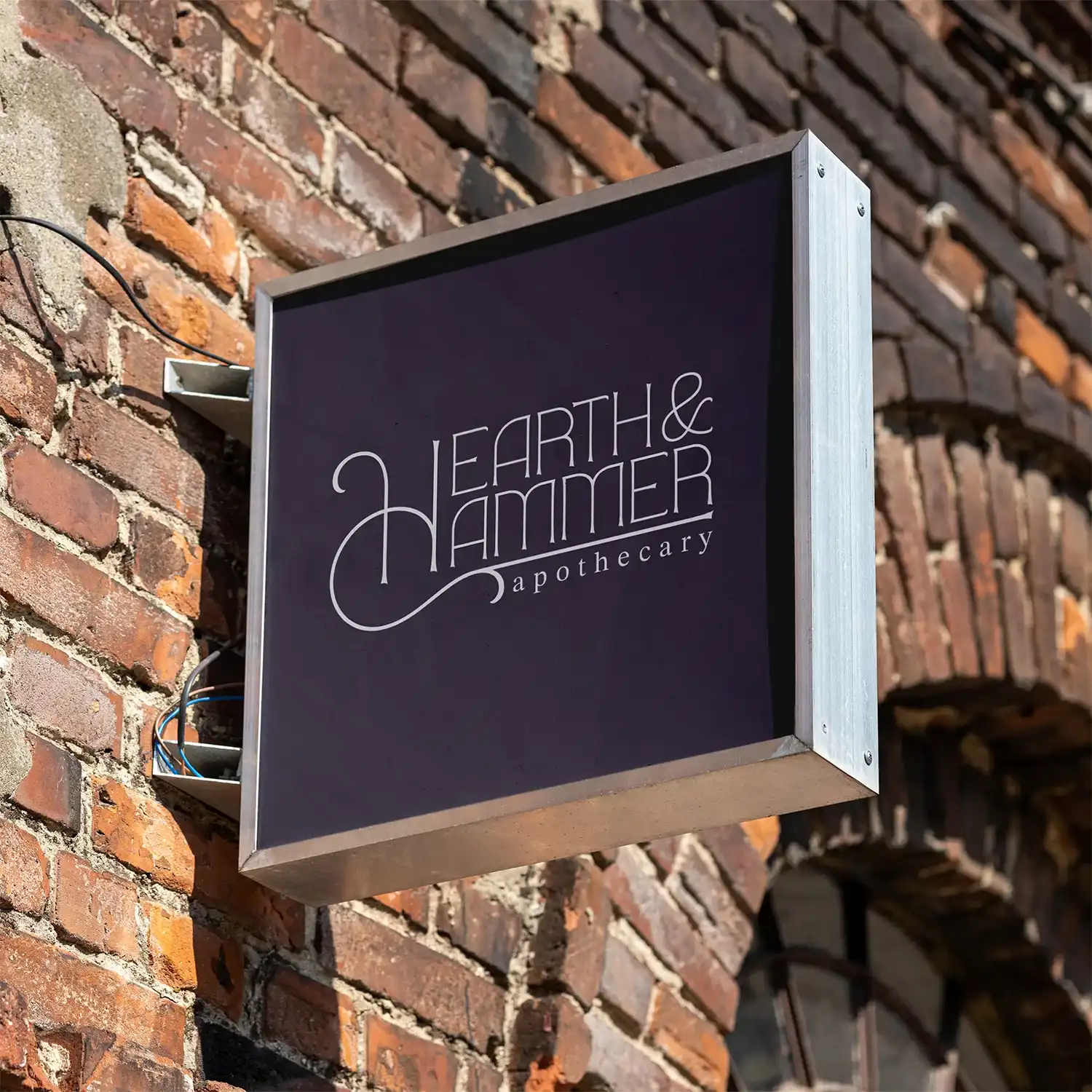
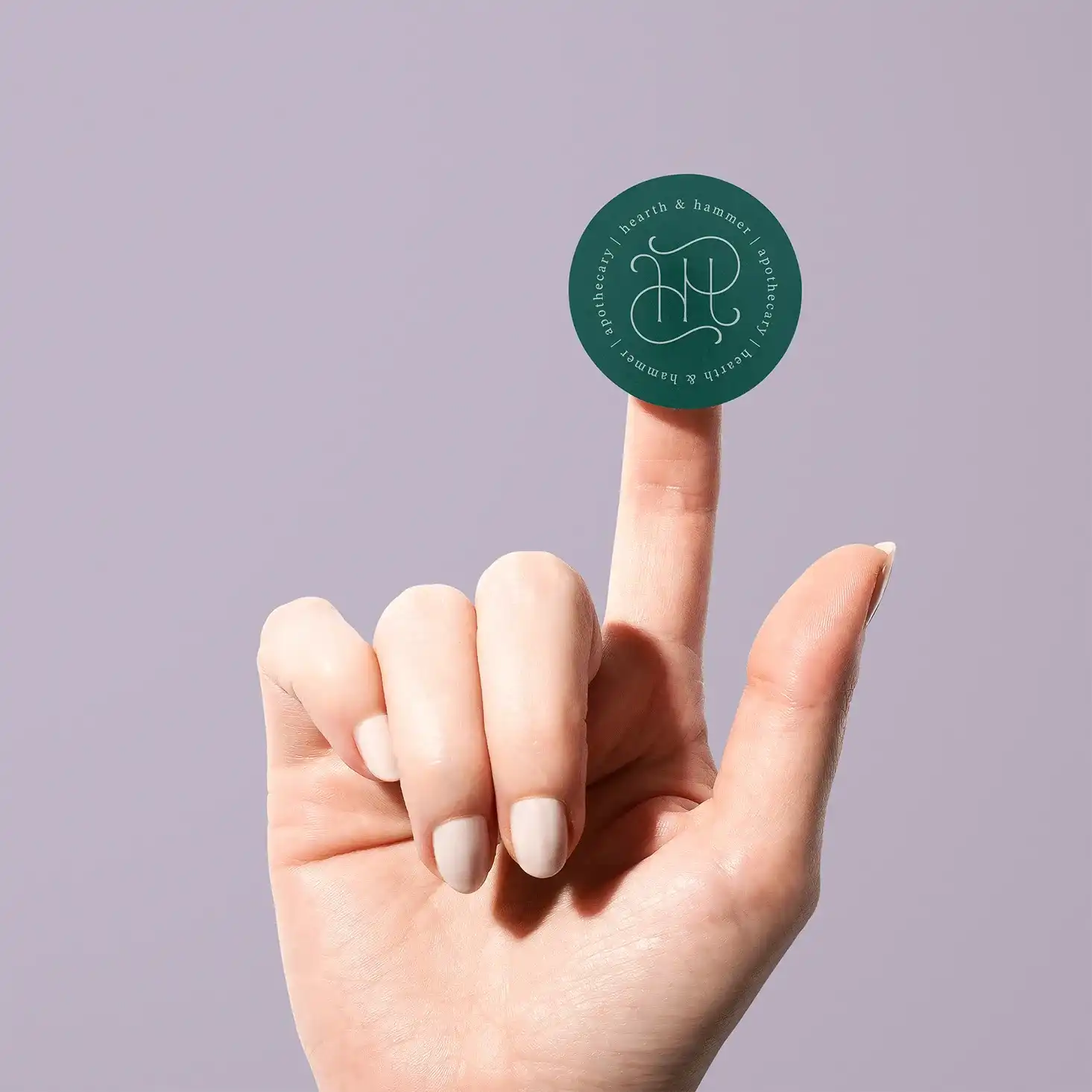
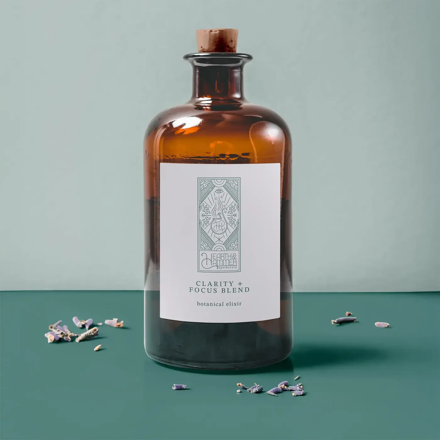
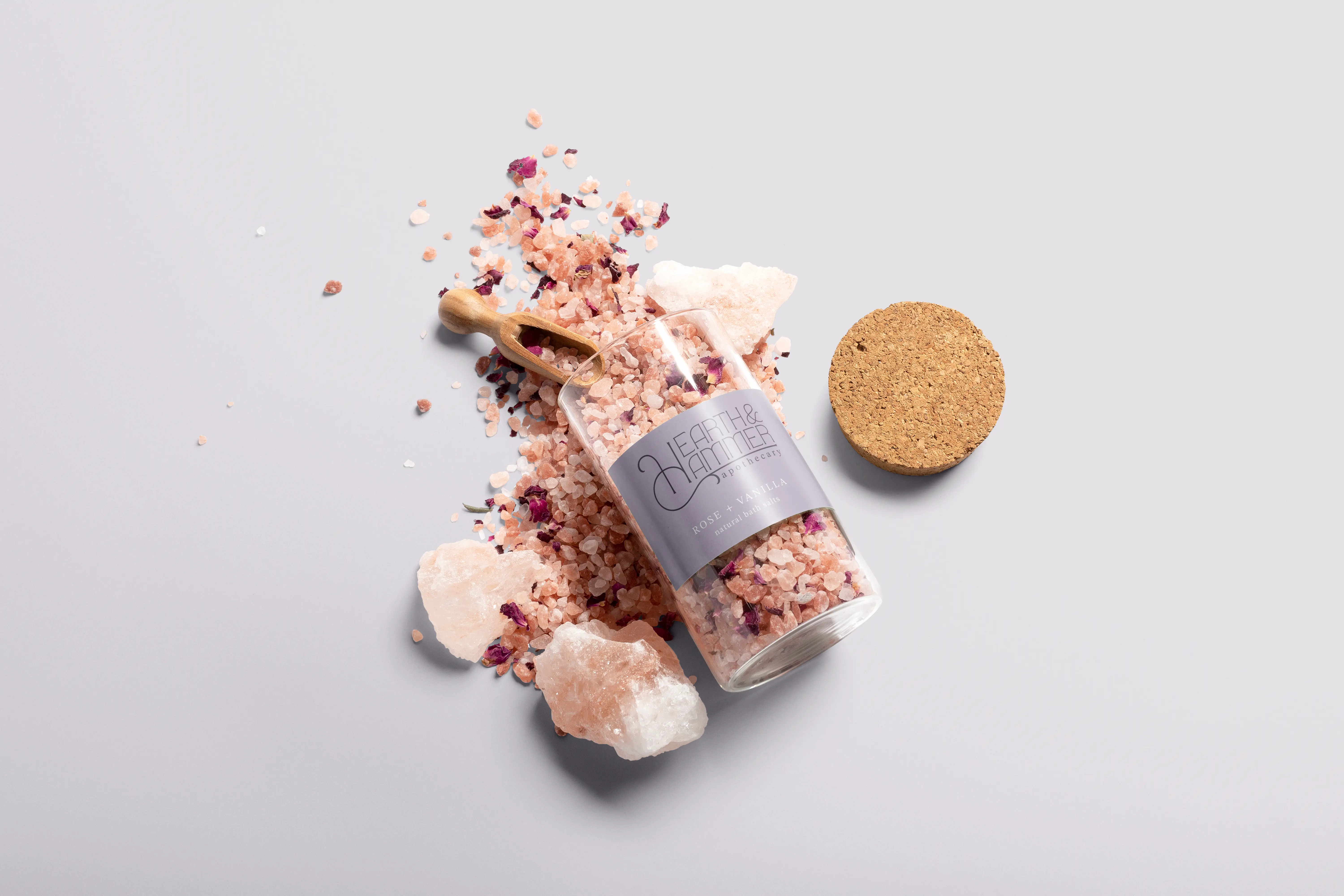
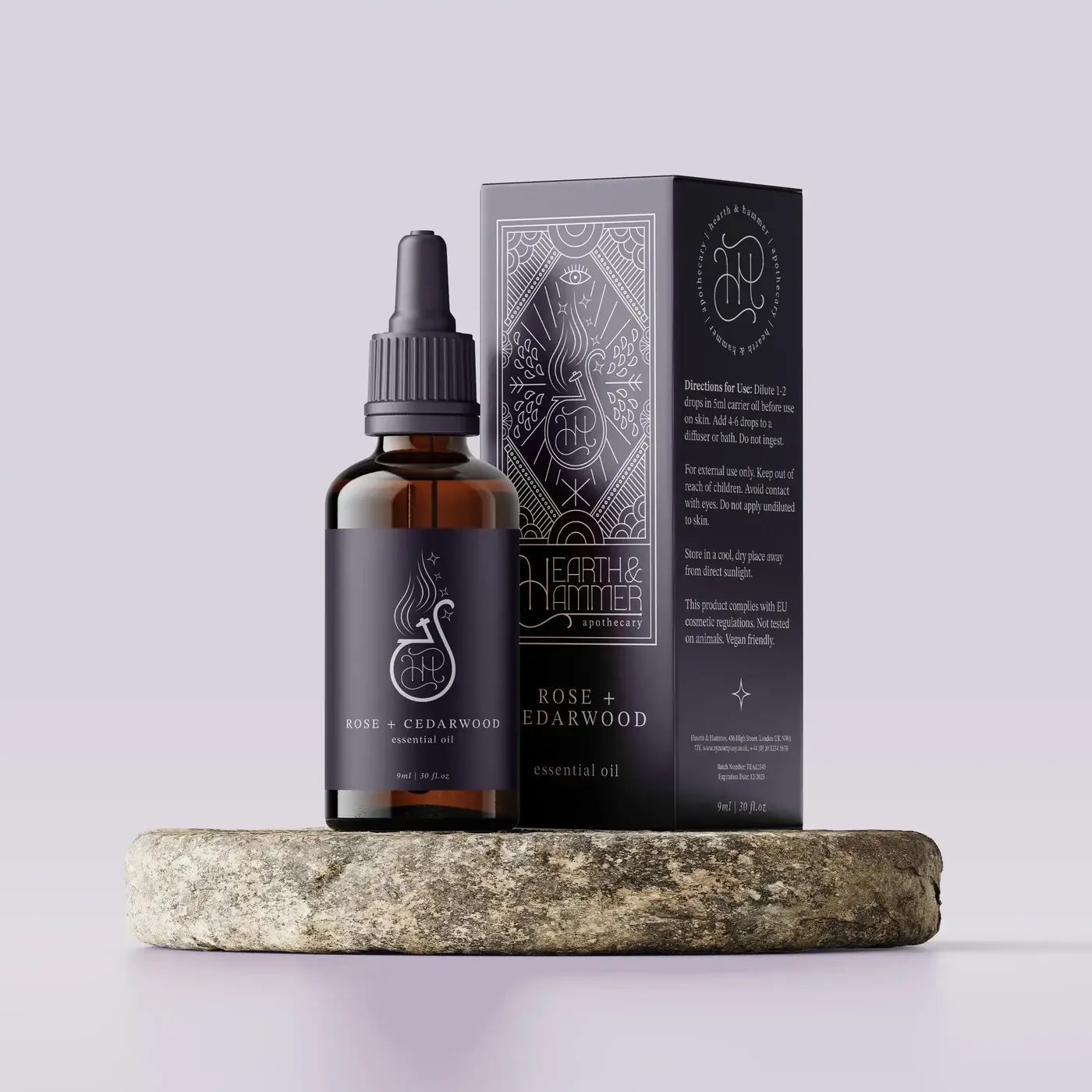
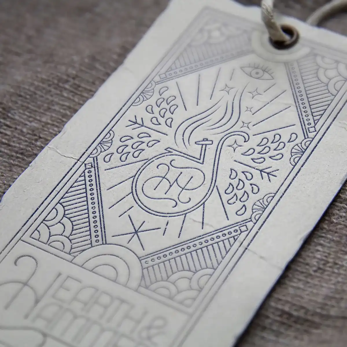
Hearth and Hammer Apothecary is a concept brand built around the idea of ancient alchemy meeting modern wellness. This was a winning competition entry for The Brief Association, and the brief called for an identity that could transport customers into a world of enchantment: a modern apothecary drawing on the visual language of witchcraft, tarot and potion making, while still feeling credible and premium enough to sit alongside high-end wellness brands. The products — tonics, elixirs, soaps, essential oils and botanical blends — needed a brand that held the mystical atmosphere without tipping into pastiche.

Hearth and Hammer brief image 1 Hearth and Hammer brief image 2 Hearth and Hammer brief image 3
Hearth and Hammer project showcase
What the studio did

The wordmark uses a thin, decorative display typeface with a calligraphic H that doubles as a visual flourish of a cauldron, giving the logo both elegance and a hint of the arcane. I built the palette around deep aubergine, sage green and soft lavender, tones that feel botanical and ancient without relying on black.

The central illustration is a tarot-inspired diamond panel featuring the brand monogram, a flame, botanical elements, and an all-seeing eye, which I adapted across product labels for a range of touchpoints that their clientele would feel drawn to.

Hearth and Hammer studio image 1 Hearth and Hammer studio image 2 Hearth and Hammer studio image 3
Hearth and Hammer project showcase 2
Hearth and Hammer finale image 1 Hearth and Hammer finale image 2